


Return of the Plant People
THE STORY
The world is losing access to plant medicines that have worked for thousands of years, while people increasingly rely on synthetic alternatives that often fall short. Happy Herb Co made it their mission to connect people with herbs after discovering their powerful benefits and how this knowledge was being suppressed. Despite 30 years of expertise in the use of medicinal and recreational herbs, their inconsistent visual identity fails to communicate their knowledge and credibility in the wellness market.

EMPOWERING COMMUNITIES WITH HERBAL WISDOM.
THE STrategy
The strategy was to position Happy Herb Co as a trusted source of herbal wisdom, while celebrating their focus on community connection and care.
The Strategy
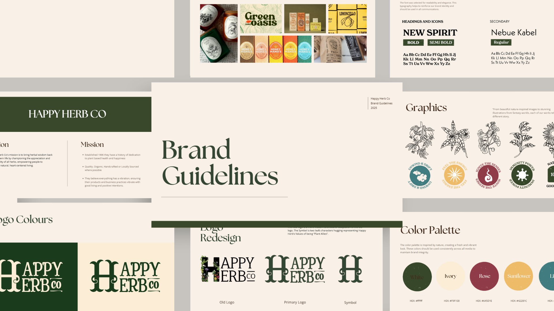
The challenge was creating a visual identity that makes plant wisdom easily accessible. The strategy was to communicate the brands warmth and trustworthiness while unifying their expansive product range. Linocut printmaking techniques brought bold, high contrast illustrations that evoke warmth through their handcrafted aesthetic. Stickers were designed to organise products by their central benefits using bold icons with labels that use friendly language that is inviting rather than clinical and cold. QR codes are placed on the back of the packaging to connect curious customers to additional plant education on Happy Herb Co's website. Clear hierarchy emphasizes benefits over Latin names, simplifying discovery. To tie the identity together, a warm colour pallet communicates a safe inviting feeling to learn about herbs and embrace herbal healing.

Herb Packaging Design
Elixar Packaging Design
The Outcome
The new visual identity transforms Happy Herb Co from a disconnected brand into a trusted ally for herbal medicine. By simplifying complex herbal knowledge into clear, approachable visuals and messaging, the design makes plant wisdom more accessible to everyone. It communicates their expertise while feeling inviting, encouraging people to move toward natural healing. This purposeful identity actively educates and empowers people to embrace herbal wisdom with confidence and clarity, helping them reconnect with herbs.
Application